
Alright. Let’s first get the disclaimers out of the way. I am not a designer. I have never been to a design school or pursued formal education of any kind, with respect to design.
But yes, after quite a few years in a “creative” field, I can pass off for someone with a slight understanding of what works and what doesn’t.
And since I am a metalhead upfront, I guess it’s finally time for me to lay down in words several strains of thought that keep me occupied. To begin with, here’s a thought that’s been in my head ever since I first laid my eyes on the Metallica logo.
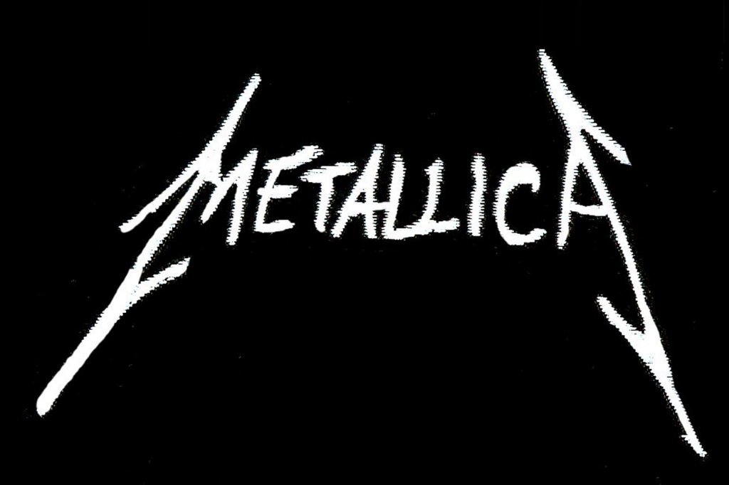
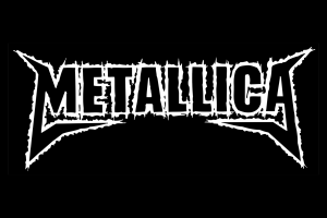
Yes, this logo. History has it that this now familiar scratch and scribble was the product of Metallica guitarist and frontman James Hetfield’s adolescent brain. He’s also responsible for the band’s famous Ninja-Star symbol, and the design for band mascot, “Head Guy”.
That scribble, though, doesn’t find its way on to any official album cover. It does, however, find its way onto numerous bootlegs, knock-off merchandise, and the furniture and walls of St. Mary’s School and St. Xavier’s College in Bombay. I may—or may not—be responsible for carving them on desks or scrawling them on to the walls. That’s a story I would neither corroborate nor deny.
So, why did that logo resonate with the band? Well, let’s start with the name—Metallica. It’s an embodiment of the music the band plays—heavy metal. Or thrash metal, for you purists. The music is abrasive, angry, loud, noisy, rebellious, and yet, angular, powerful, structured, and technical.
You can’t really imagine a band like that to sport a logo or a typeface that’s well, relaxing. Or soothing. Or cute. Could you image the logo in a rounded typeface? If you can, draw one up and share it online. Just don’t tag ‘Tallica fans.
The simple scribble, like it or not, did command attention. It’s straight-forward. It’s powerful. It makes a statement, and pulls no punches. The only thing it lacked was heaviness.
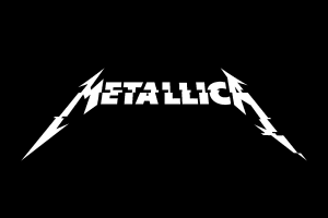
That’s the reason the band (and, of course, its management), took the initial scribbles and asked professionals for some improvements. The result?
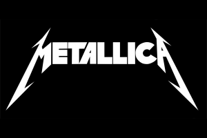
Damn. That’s a treat, isn’t it? It’s now thicker, bolder, and dare I say, heavier? It’s also extremely sharp. Like it could adorn heavy machinery. Or power tools. Or a hot-rod. Or a muscle car. Or noisy amplifiers and gritty distortion pedals. Getting a drift?
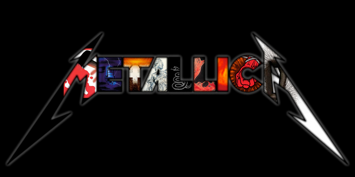
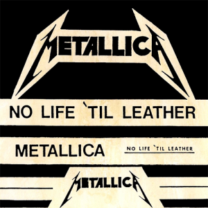
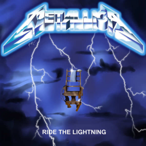
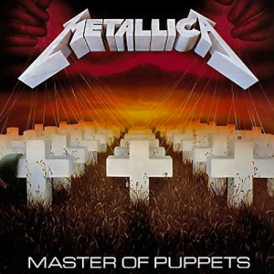
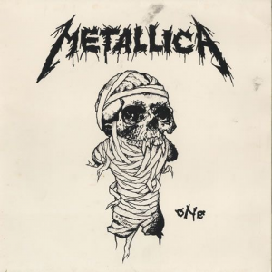
This base logo remained the band’s identity for nearly 17 years since the first official demo, No Life ’Til Leather, released in 1981. Each new release in those 17 years did play with the logo in some manner—bevels and 3D touches on Ride The Lightning (1984), that lovely heavy drop shadow on Master of Puppets(1986), or the gruesome gooey splatter for One (1989), the lead single off the band’s fourth album, And Justice For All, and so on. It was the icon that stayed with the band through its kick-ass, no-shit-taken years. The years that produced the band’s best music to date.
But then, Metallica turned 18. And now as an adult, and one with oodles of cash to spend, I guess, the band just got shitfaced and decided to, well, change their image. The long hair was cut, the music lost a bit of its heaviness in favour of radio-friendly rock n’ roll, and the band logo changed.
And if you still haven’t inferred it, I am not a fan of this era of Metallica—the albums don’t particularly excite me (well, save for the excellent S&M, released in 1999), the album artwork isn’t particularly metal, and neither is the logo. Okay, it may have some of the angularity of the earlier logo but it lacks strength. It looks like the product of a decision to increase the mass appeal of the brand, err, band.
Needless to say, this logo didn’t really sit well with the early Metallica fans. Still, it remained with the band, again, in some form or another, all the way till 2003.
St. Anger took the fans by surprise. I’d reckon it was Metallica’s mid-life crisis. Sure, the album was heavy and noisy, but it was too long, so long in fact, that it did serve as an ear-sore for most listeners. Many listeners felt that the band tried too hard to be their earlier, adolescent selves. That they forgot that reigning it in was an option. You can see the same in the logo as well. Over designed? Hell yes.
Five years passed till the next Metallica release. On 2008’s Death Magnetic, the band was slowly sobering up. You could hear an effort to recapture the sound that gave the band it’s earlier notoriety. While the album itself wasn’t something to really write home about, it kept most old-school Metallica fans satisfied. And that translated to the logo as well.

This logo was a product of design firm Turner Duckworth, renowned for their work on Coca-Cola, Amazon and Dolby. It was a cleaner iteration of the original logo. Smoother. Neater. Yes, the impact was just lost a wee bit, but it was a welcome change. Kind of what I’d imagine myself after my mid-life crisis. Wiser. Not as aggressive, but just a bit rounded off. Solid as ever.
And the band really hasn’t changed its logo after that. The 2016 album, Hardwired… To Self Destruct saw the band firmly return to its roots with a smattering of tunes that gave all Metallica fans—even the old, hardcore ones, plenty to cheer about. And while the glitch effect does ground the band in today’s digital times, it’s just another playful iteration of the base logo itself.
Whew. So there you have it. A brief history of the Metallica logo.
And now that you have some time on your hands, here’s a nifty site to make your own logo, in the style of the classic Metallica logo: http://metallica.alwaysdata.net/1479450978
And if you’d like to play around with the fonts, you can find “Pastor Of Muppets” online, relatively easily.
Till the next time, keep rocking.
**
Animesh. @asmoani. Video. Music. Heavy Metal. Horns Up. Riot Peddler. Wrestling. Then. Now. Forever. And Dinosaurs. And Food. And TV!